As a matter of a fact, there are a lot of uncertainty about the user of the web, and that is what makes it exciting and challenging in the same time. You will never be sure about the user who visit your website’s conditions of Network, Device, Screen size, Preferences, or from which Browser they are browsing, in this post I will get you through some tips to mitigate the effect of these conditions, with some easy to apply recommendations.

🌍 Web is for everyone
Our mission as web developers is to make the web accessible to everyone, regardless of their conditions, at least they should have the minimum functionality of the web app working fast and reliable, it should be fast enough in loading, in good contrast (according to the user), and looks accessible on any screen size.
This is not an easy task to do, and in my opinion this is what makes working on web more exciting than any other thing (at least for me) these type of challenges are pretty nice to tackle and fix, and feels so satisfying to build a website that is accessible by everyone.
To guarantee the user experience for every user while building your app with latest technologies, you have to choose one way from the following three:
- Buy latest MacBook pro to all your users: in this case all the users will have almost the same experience as you do on your development machine, but this solution seems to be a bit expensive.
- Build for the worst condition: in this case you will build the website with the worst conditions of Network, Devices, and Preferences in mind, this will indeed fix the problem but people with new and capable devices and fast connection would not get the best UX indeed, the web app would feel very basic and not entertaining to browse.
- Build a website that adapt to user conditions: this is the best choice, is to build your web app for the best conditions and check for each and start Graceful degradation gradually, or the opposite to build for the worst conditions and check to enhance UX as you go if the user’s conditions gets better and this is known as Progressive enhancements.
This 3rd option is the one that we are interested in today.
📈 Know your user
This is the most important piece of advice that I can give to anyone who wants to invest in optimizing the performance of their website, simply You Need To Know Your User, with these information you can be sure about your steps and the time and efforts you are going to invest, optimization in general is a costly task.
We cannot fix any problem without proper enough data in hand, that’s why for example if we have a performance issue we run some tests and measure some metrics. The easy go-to solution is browser’s devtools, simply to run Lighthouse and get a score as a starting point to enhance, which is a great starting point but not really giving enough information or hints about your real user.
Real User Monitoring (RUM) in this case becomes more valuable, gathering information about the real user by opting them in, getting the device type, internet connection, screen size, Core Web Vitals, Access from which browser, and much more.
Using these information in hand, we can simply classify our user base, understand their pain points, spend time in the more impactful issues for the user, and most importantly, make our website adaptive to all user’s conditions.
🖐️ Five User Conditions to Tackle
Let’s dive into some of the main user variables or conditions, and in order to present the best UX you need to spend time to enhance that for most of your user base, make everyone happy with visiting your website.
1. Device Screen Sizes
Users use a wide range of devices to browse the internet, it can vary from the smallest smart phone to a giant smart TV screen, we cannot control that but we can try to make the experience pleasant for all users.
There is no doubt that most developers are familiar with this user variable and its fix, which is responsive design for different screen sizes, usually that is done in CSS media queries, I am not going to spend too much time in this part as it is obviously the most common case out of all of them, but as a rule of thumb, Build your components responsive like water or cats 🐈, they fit in any container you put them in.

I would just advice here to check also CSS containers as it has very good support now and might be better in some cases, also for responsive images, I would always advice to serve the exact size of an image that matches the screen size of the user.
<img
  srcset="elva-fairy-480w.jpg 480w, elva-fairy-800w.jpg 800w"
  sizes="(max-width: 600px) 480px, 800px"
  src="elva-fairy-800w.jpg"
  alt="Elva dressed as a fairy"
/>
In the code above, you can provide multiple versions of the image and serve them based on the viewport size
2. Browser Support
User can access your website from any browser they prefer, some of them are very famous but others are not, you can extract this from your RUM data for your user base or from your analytics tool.
Despite the efforts to standardize browsers in most features, still some browsers might support some part too late, for example Edge didn’t support Avif image extension for long time until Feb 2024, which makes us usually create a fallback to webp or jpg in the worst case.
<picture>
  <source srcset="photo.avif" type="image/avif" />
  <source srcset="photo.webp" type="image/webp" />
  <img src="photo.jpg" alt="photo" />
</picture>
It is not only about the images, also videos are very important to use the lightest one with highest quality, so providing a video in mp4 is usually in a good quality however looking for webm is much smaller in size, so you can always provide both options and based on the user’s browser support they get better or worse experience.
for CSS features that are not fully supported yet, you can use something like @supports to check for the supported features and provide maybe a fallback way in case of not supported.
3. User Preferences
Users own their devices and usually they set some preferences, like theme color, font size, background, and so on, but also they can set other preferences that you should be familiar with and adapt them in your website, which will draw a smile on the face of your user while browsing your website.
This part is usually missed for most people, either on mobile or on desktop, users can set their device with some preferences, may be the most common one is elderly people enlarge the overall font size of the device, and you are expected to be responsive to that and for example not to use px for font sizes and use em and rem instead.
But I would like to point to other preferences that are not common, here are some of them that you can make your user happier if you act based on them:
prefers-colors-scheme: this media query can be set to check what is the user preferences regarding the theme, dark mode or light mode as follow:
@media (prefers-color-scheme: dark) { … }prefers-reduced-motion: some users have a problem with animations, it would be best to check for that preference and adapt to it but providing less motion or remove it completely.prefers-reduced-transparency: Also some users set this preferences on their devices to give a hint that they have a problem with transparency, so if you have a specific item with low opacity you can check for that preference and increase it, example:
.translucent { opacity: 0.4; }
@media (prefers-reduced-transparency) {
  .translucent { opacity: 0.8; }
}prefers-reduced-data: This option is extremely useful to check, if the user set this preference, it means that they are in slow connection or limited data internet, and what is expected from you is to remove anything in CSS that takes a heavy download, like video backgrounds or images background.
4. User Device (CPU/RAM)
As mentioned earlier, different devices of the users is something that we cannot control, and if we look at the median devices in the world, they are not high end devices, meaning that they mostly have very limited CPU and RAM.
If we build a website that includes some heavy processing and consumption of the RAM like a 3D model for example and serve it the same for all users, we are killing the experience for the people accessing from the weak device.
window.navigator.deviceMemory🧪: It returns the approximate device memory in GB, you can send these info to server as memory hints to send memory heavy items according to available memory like 3D models. (hint that this is still experimental and not fully supported yet)window.navigator.hardwareConcurrency: returns number of logical processors available to run threads on the user’s computer. You can use it to know the max number of web workers that can run
I can also recommend if you discovered that your user device in wear using the APIs above the following:
- Zooming in/out and animations in slow devices can be disabled
- Image carousel can load other images on intent
5. Internet Connection
Finally, users are connecting to the web through different internet connection strengths from Edge to 5G, the expectations in 2030 is to have 5G taking the lead and to see less and less people using 2G and 3G.
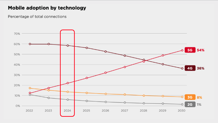
But let’s face it, we are still in 2024 and we have around 25% of the internet users using either 2G or 3G, and indeed the majority are using 4G.
Building a website with the same way and serve it to all those different users is a bit of a gamble that nothing will happen, this might come from the fact that we as developers are usually working with strong devices and strong internet connection, and some of us ignore testing how the web app behave for people in poor connection.
Browser APIs: window.navigator.connection 🧪
Chrome introduced this experimental APIs that helps you with an idea about the internet connection at the user end, with these info you can adapt and either serve less, or cancel all the background heavy downloads to save user’s data. (hint that it is still experimental and not fully supported yet)
Calling this command will come with the following:
{
  downlink: 3.85;
  effectiveType: '4g';
  onchange: null;
  rtt: 50;
  saveData: false;
}
Based on the effectiveType if it is 3G or lower we can serve a different experience which still could be good enough but maybe not the best as people with better connection.
As an example:
const connectionType = navigator.connection.effectiveType;

switch (connectionType) {
  case '4g':
    return <Video src={videoSrc} />;
  case '3g':
    return <Image src={imageSrc.mid} alt={alt} />;
  default:
    return <Image src={imageSrc.low} alt={alt} />;
}
In the example above we serve a video in case of 4G and serve a mid quality in case of 3G and in other lower connection a low resolution image can still help the UX without hurting the loading time.
Here are other recommendations in case of slower connection:
- Fetch smaller number of items per page in slow connection
- Change a heavy custom font to a system font
🔥 Hot Tip: If you are using react, you can checkout the ready abstracted lib called React Adaptive Hooks to check for network and other APIs mentioned in this article.
📃 Conclusion
In this article I tried to explain the different user conditions and how can you give the best user experience and performance to all your users.
How to adapt to device screen size, Browser support, User preferences, User’s device CPU and RAM, and finally how to optimize for the internet connection.
I hope you learned something new in this article, if you have any inquiry let’s continue the discussion on X(Twitter).
Tot ziens 👋